(note: this article was previously published in French in February 2012 - if you have any feedback on the translation made by Nicolas Hoffmann, Gilles Chagnon and Stéphane Deschamps, please let us know)
Often out of ignorance, text contrasts are treated quickly, sometimes completely overlooked. However, they are very important for website accessibility and more broadly for the readability of websites. Moreover, once you know about it, this point is often easy to deal with, accessibility-wise, using CSS, and it brings great benefits.
Even people who do not have any disability take advantage of it: the reading experience is much more enjoyable if the user does not have to squint to read text!
Some statistics:
- it is estimated that 15% to 20% of the population of the United States have difficulties reading (including dyslexia),
- according to the INSEE [1] (2002), 3.346 million people in France reported having a vision disease (out of a total population of about 60 million people),
- approximately 8-12% of the world population would be dyslexic, 5 to 15% of children,
- frequency of colour blindness is, on average, 8% in men and 0.5% among women worldwide.
Vision problems are accentuated with age and, as the secret of eternal youth has not yet been discovered, it is easy to understand that sooner or later, the question of the readability of texts will concern a majority of people.
WCAG recommendations: good guidelines
Contrasts
Following the WCAG 2.0 recommendations issued by the W3C, to comply with the AA level, rule 1.4.3 tells us:
The text (or images with text information) less than 18 points (or 14 points bold) should have a luminance contrast of at least 4.5 to 1 with its background.
The text (or images with text information) of 18 points (14 points or more in bold) should have a luminance contrast of at least 3 to 1 with its background.
Again, according to the WCAG 2.0, to comply with the AAA level, rule 1.4.6 tells us:
The text (or images with text information) less than 18 points (or 14 points bold) should have a luminance contrast of at least 7 to 1 with its background.
The text (or images with text information) of 18 points (14 points or more in bold) should have a luminance contrast of at least 4.5 to 1 with its background.
Important note: figures and recommendations contained in this article are only applicable to reading on a screen.
You may find mathematical formulas to calculate contrasts.
Tone difference and brightness
Next to contrast calculation, other indicators are interesting: brightness and tone difference. The formulas to calculate the tone difference and brightness are also available. However given their complexity, explaining them in detail would require a much longer article.
It is recommended to have a brightness greater than or equal to 125 and a tone difference greater than or equal to 500 to ensure good readability.
Of course, we won’t do tedious calculations each time we need to evaluate the text and background colours, utilities can check this information for us… and of course enable us to correct accordingly.
Utilities to study text contrasts
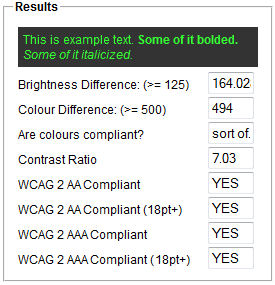
Color contrast check

Color contrast Check is a very convenient web tool, it displays contrast values and tells whether they are consistent with the WCAG. Also, it indicates the tone difference and brightness.
Even more conveniently, it allows you to adjust colours on the fly and see the impact on the results. A very good tool to study and adapt the colour choice quickly and efficiently.
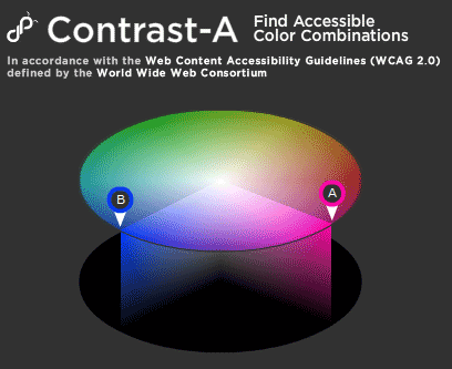
Contrast-A

Contrast-A is more oriented towards finding the right colour and choosing the right palette. However, it is very complete:
- it also allows you to view these choices with different types of disabilities, such as various types of colour blindness (protanopia, deuteranopia and tritanopia) and total colour blindness,
- the option “thresholds” is very useful to pick up colors,
- scores are assigned to each colour choice for each disability type,
- and all values are calculated: contrasts, luminosity and tone difference.
A problem: this tool uses Flash. You may prefer using Accessibility Color Wheel.
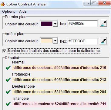
Color contrast analyser

Color contrast analyser is a software (on Windows and Macintosh) which calculates brightness and tone, as well as the values for the various types of colour blindness. This allows you to see if pages can be viewed correctly by people with these disabilities. It is very complete and easy to use.
Firefox extensions

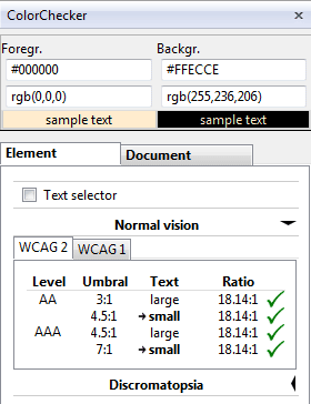
Extensions like WCAG contrast checker for Firefox can quickly evaluate text contrasts. A simple click allows you to quickly see if your texts comply with the WCAG 2.0.
Other tools in graphics software
Photoshop has featured since its CS4 version filters for colour blindness, which can be found under Display > Proof Setup > dyschromatopsia (protanopia and deuteranopia).
Important note: although the article focuses only on contrasts (for obvious reasons of length), text readability can’t be reduced to this mere question. Some of the tools presented above take into account the size, but other factors can influence the perception of colour contrasts and modify the inconvenience to the user:
- font choice (with or without serif, form and weight of the lettering),
- applied styles (bold, italic, uppercase letters),
- space between letter and lines (remember to use a sufficient value for
line-heightproperty in CSS), - text length (what is suitable for a title could not be good for long paragraphs),
- the behaviour of the font when the user resizes it,
- anti-aliasing quality for the font, depending of the operating system and/or the software used,
- etc.
Recommendations, values… but not an end in itself
Taking the recommendations to the letter and relying on the tools proposed above, we might think that strong contrasts are ideal, either a light colour on a dark background or a dark colour on a light background… however things are not that simple!
Negative or positive contrast?
Research has shown that texts with a positive contrast (dark text on a light background) are more readable than those with a negative contrast (light text on dark background).
Here are a few other situations worth considering:
- a dark background accentuates reflections, which can be very annoying especially while in mobility, even more so if there is a glaring sun behind you,
- another issue in mobility, a laptop screen displays much less light to save the battery, and insufficient negative contrast can result in a serious drawback.
Note: bear in mind that the aim is not to proscribe colour combinations or prohibit negative contrasts, but to achieve maximum readability.
Strong positives constrats?
Contrasts that are too strong, even positive contrasts, stress the eyes, hinder your reading and accentuate ocular exhaustion.
Pure black #000 on pure white #fff can cause issues for example for dyslexic people: a very high contrast may give the feeling that the text is "shaking" or "moving". This issue is known as the "Irlen syndrom" or "scotopic sensitivity syndrome" and does not only apply to dyslexic people.
Also, a pure black text on pure white background accentuates the halo effect for older people and/or people with a high sensitivity to light. To understand how this feels, just imagine reading a text in a dark room on a very bright screen: you would need to squint to distinguish the text as strong white light tends to be blinding.
In these cases, you must either use a very light grey background colour instead of pure white, or slightly lighten the pure black of the text.
Conclusion
Everything is in a good balance: a good contrast is necessary and important; however too high values must be avoided. Several tools allow you to find satisfying values, both during the graphic design phase and while writing your CSS.
It is even common to see that even a slight adjustment with the above mentioned tools can result in a much more comfortable reading experience, even for audiences who did not have visual impairments.
References, complements:
- Colour Contrast Check
- Accessibility Color Wheel
- Color Contrast Analyser
- 6 surprising bad practices that hurt dyslexic users
- Letter identification performance is better for negative contrast than positive contrast
- Irlen syndrome, or Scotopic sensitivity syndrome
- Colour blindness (Wikipedia)
- Statistics on disability in France
- Tanaguru Contrast-Finder

Your comments
Follow the comments: |
|
