(Note: this article was previously published in French in December 2012 –if you have any feedback on the translation made by Nicolas Torres, Nicolas Hoffmann and Stéphane Deschamps, please let us know.)
The myth of the devices
According to an urban legend, breakpoints are equivalent to device screen sizes. Those who first claimed it did so when both the iPad and iPhone dominated their respective market. So it’s easy: we only have to adjust the Web site to these devices —which account for 90% of the mobile navigation—, and that’s it. Yes. But no. Today, things aren’t that simple anymore.
Nowadays, there are plenty of viable devices to browse the Web. I’m thinking about the Nexus 7, Galaxy S3 & Galaxy Note, Nokia Lumia and so on, which give as many different resolutions. You can choose to deal with each of those screen sizes. You can also choose to think your breakpoints in regard with the content, and give your users an optimal legibility regardless of the device used.
A content story
I’m intentionally ignoring margins in the measurements because they are negligible and their absence does not prevent understanding. Note therefore that the specified values are approximate tens of pixels near.
The text
Typographical advices say that text has an optimal readability
when decomposed into lines of 55 to 75 characters. This constraint guarantees a comfortable reading to your visitors. However, on a mobile device in portrait mode, it is impossible to hold as many characters with a suitable font size. It’s not a big issue, as you cannot really do otherwise. The first breakpoint to set is the one that corresponds to a single column, to suit a length of 55 to 75 characters per line for your texts. According to some tests and analyses, this value can vary up to 90/100. In our example, a kind of editorial site blog, the reading can be long on a mobile device. I define a text size to 14 pixels – below, the eyes get tired very quickly, and above, the reading rhythm is jerky –, and I made some tests to achieve an optimal and maximum size of 600px.
The first size does not correspond to any device, and is wider than the screen of a smartphone. As mentioned above, this constraint must be taken into account.
We get a configuration similar to the following:
.wrapper {
box-sizing: border-box; // to apply a fixed padding
width: 100%;
max-width: 600px;
margin: auto; // centred when screen wider than 600px
padding: 0 0.75em; // 0.75em = 1/2 of line-height
}
Similarly, I get levels of 600px maximum for a text column in the footer. For the transition to two columns, we will not wait for 1200px because our lines would be too wide. It is better to reduce a little even if we’re not reaching the 55 characters per line, to split the block into two columns. Let’s say 800px –a level that will work for images, as we’ll see next– to respect the harmony and avoid multiplying possible layout configurations.
From 600px to 800px, we will centre the content block to avoid stretching our texts. Beyond 800px, we reorganize contents related to the article to position them to the left and the right of the main content.
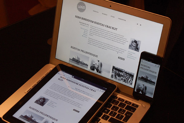
Images
My images are 312px wide. In reality, they are double, but at a low quality to ensure proper display on Retina screens, they are losing very little quality when viewed in 312px (proof of concept). This method has an advantage: my canvas image can exceed 312px in a reasonable way without blurring the image. So I can define my level with flexibility.
Returning to my first level of text, which was 600px, I realize that the quality of my images will not be appreciable on a Retina display. So I’ll put them in two columns. I can easily go to a 400px-wide column. The split in two columns will be made at 400px, which leaves us barely 200px for an image. It’s a little short, but that’s okay. If the images were playing a more important role in the understanding of the contents, we could revise the size set and certainly set up a higher level. In this case, it is OK, so we
keep 400px as splitting level for the columns of images.
By extrapolation, we will display 3 images per line above 800px.
To sum up
So, we have defined 3 levels: 400, 600 and 800px.
- Up to 400px: all sections are displayed in a single fluid column .
- From 400 to 600px: the width remains fluid, the text remains as a column in the article and in the footer, and the images are displayed in 2 columns.
- From 600 to 800px: width is fixed at 600px and we centre everything, because nothing very relevant will be done with these additional 200px here.
- Beyond 800px: we display the information of the article as well as images on 3 columns, and divide the footer into two parts. We limit the display to 984px, which corresponds to the size of the initial mockup.
You can go further and think of a widescreen display, for
example by increasing the overall size of the text or putting blocks side to side.
To remember
- The breakpoints are defined to fit your content, not specific devices.
- 55 to 75, or 90 characters per line to ensure the reading comfort for paragraphs.
- Think about your image design as early as possible in your design process to make sure to have them correctly displayed. Do not forget HD screens .
- Responsive web design is not a feature, but a basic accessibility requirement.
Conclusion
You now have the basics to find breakpoints that really correspond
to your content, not to a device. The market is too fragmented to
promote a product rather than another. Keep in mind that the responsive web design is not a full ergonomic answer –like a native application– but an adaptable solution to secure a minimum of comfort on all devices.
Your comments
# James Sinclair On 21 March 2013 at 04:00
Hi,
I like your article and totally agree with the whole "define breakpoints to fit content, not devices," concept. With that in mind though, I’m wondering why not use ems rather than pixels to define your breakpoints? If you are basing your breakpoint decisions on the number of characters per line, then ems seem like the perfect solution.
# noclat On 22 March 2013 at 10:59
Hi! Your remark is relevant, but I wanted to make the things straight and easier to focus on what matters instead of technical points. We could have used em here, it would have been the same (and even better), but ems on media queries are based on the default browser font-size. That creates more things to be careful of — actually, we could write an entire article on it.
Your comments
Follow the comments: |
|
